How to Craft Email Templates with Strong CTAs for Booking Meetings
Need to book more meetings? Let's go through how to write email templates with killer CTAs that'll fill your calendar.

Daria Roshchyna
Create your free booking page

We think we know everything about emails. But do we really? What makes someone open an email, read through it, and actually click that button to book a meeting?
Well-crafted email templates are key to achieving this—they simplify communication and keep our messages consistent and compelling.
These templates are more than just a handy shortcut; with the right words and a strong call to action, they increase the chances of recipients booking a meeting, making our efforts more effective and rewarding.
Let's talk about crafting email templates with strong CTAs that make people want to book a meeting with you.
What makes a good email template?
Think of it like building a house: you need a solid foundation, a bit of style, and a design that speaks to the people going to live there.
A good email template is like that—it has everything in the right place and a look and feel that draws people in.
What should this template look like? Let’s speak first about the holy trinity—structure, design, and language.
Writing for clarity and engagement: Write like you mean it
Nobody wants to read an email written by a robot. Or by AI. Make your message clear and easy to digest. Imagine chatting with a friend over coffee—share stories or examples when you can.
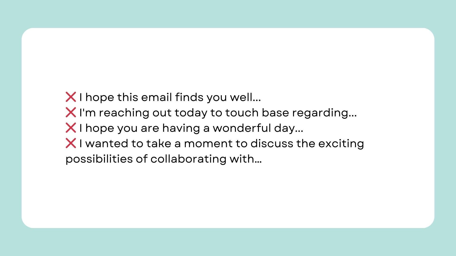
No need to start with a mountain of cliches and over-polite but lifeless phrases:
But now, how do we make the text of the email template effective?
- Start with purpose: Begin your email by clearly stating why you're writing. For example, "Hi [Name], I'm following up on our recent discussion about [topic]."
- Use appropriate language, and do not use overcomplicated abbreviations or too formal (or too informal) wording.
- Incorporate personal touches: Address your recipient by name, reference past interactions, or mention relevant details that show you've been paying attention.
- End with a clear call to action, a direct request, or next step, like "Could we set up a call next week to explore this further?"
And don't forget to add a catchy subject line! They're what get your emails open, after all.
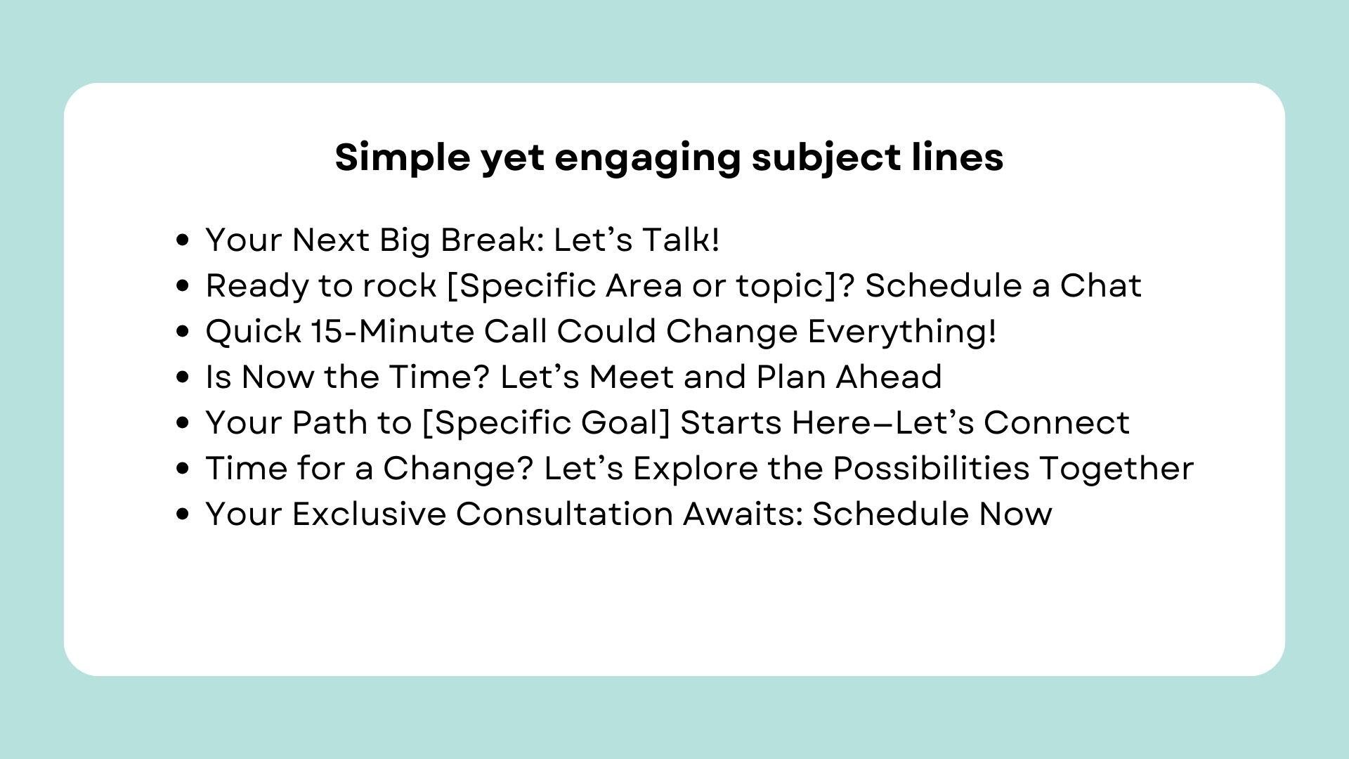
Here are several examples of simple yet engaging subject lines for emails that aim to get that meeting booked:
Remember that the subject line (and email text itself) shouldn’t be overpromotional or promise something unreal. And it’s not only about being honest—email service providers may send your message right to the spam folder if it's too salesy.
To make sure these emails reach recipients' primary inboxes, use a transactional email service. It gives advanced delivery optimization features, like monitoring tools, so you can check your email's spam score and get suggestions for improving deliverability.
That way, before using an email template, you can ensure it doesn’t land in spam 10 out of 10 times.
Why design matters in email templates
Design is king. You want everything in the email to look neat and inviting. When your email design is spot-on, people are more likely to stick around and read it. And don’t forget to keep it looking sharp on phones and tablets, too.
Your templates should always have a clean layout. Go for a structured format with plenty of white space so the reader isn’t overwhelmed with mile-long sentences.
And for emails that push users to book a meeting, avoid clutter. Stick to a single-column layout to guide the reader's eye naturally from top to bottom.
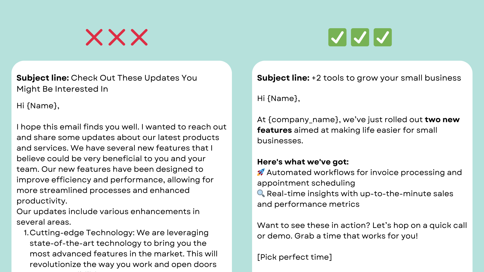
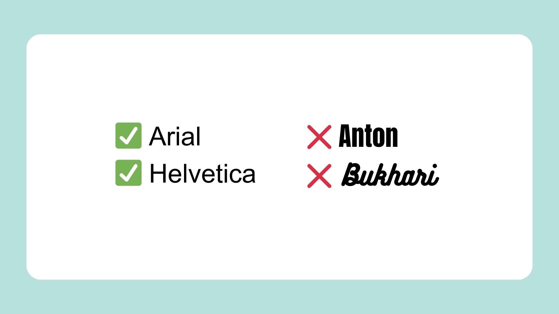
Always choose readable fonts. Use sans-serif fonts like Arial or Helvetica that are easy to read on screens, big and small. Keep font sizes large enough for comfort, and ensure text contrasts nicely with the background for readability.
Incorporate visual hierarchy, with headings, subheadings, and bullet points, to break up text and highlight key messages.
Also, add and visually highlight the booking link so the user opens an email and sees the link or button right away.
In a world where most people check emails from their phones, you must always optimize your emails.
Before sending it out, test your email on multiple devices to ensure it looks great on smartphones and tablets. Use responsive design techniques, such as scalable images and fluid grids, to ensure your email adjusts to any screen size.
Incorporating effective CTAs
The CTA is the final nudge that gets your reader to act—like booking that important meeting you aim for. Here's how to make sure your CTA stands out and works effectively.
Where to put your CTA
Make your CTA button impossible to miss. Easy to find, easy to use.
It’s a common (and effective) practice to place your CTA at the top and bottom of your email—yes, two times per email! This way, it catches the reader's eye right away and gives them another chance to act once they've finished reading.
How to build your CTA
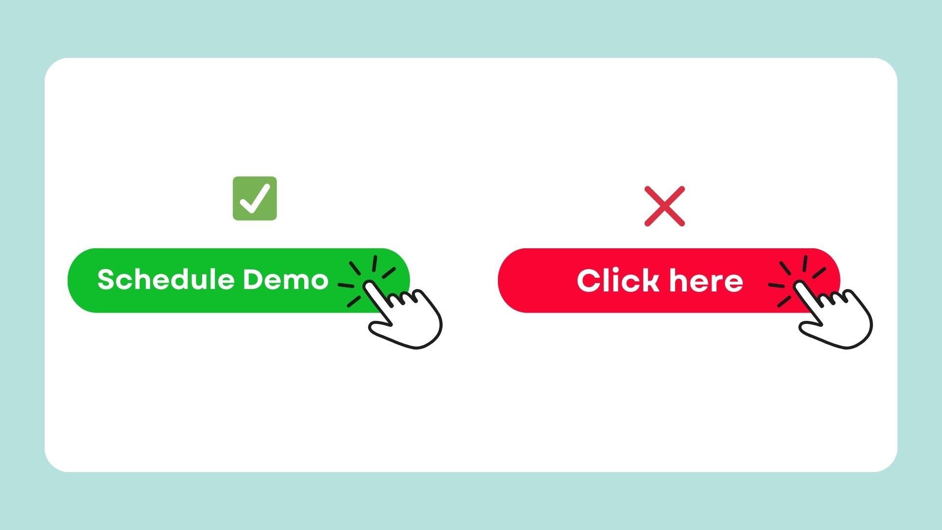
A button color that contrasts with the rest of the email ensures it stands out, making it the first thing a reader notices.
For instance, a bright red (but not too bright) or vibrant green button on a neutral background can draw the reader’s eye directly to the CTA.
Different colors evoke various emotions and reactions. For example, red often creates a sense of urgency, while green is associated with action and success. Choosing the right color can subtly influence the reader's decision to click.
The importance of actionable language in CTAs
The words you choose for your CTA can be just as powerful as where you place it. Actionable language is direct and makes it clear what step you want the reader to take next.
Use strong, even commanding verbs that leave no doubt about the action you’re prompting.
For instance, instead of a vague "Click Here," opt for more specific directives like "Schedule a Meeting" or "Claim Your Spot" that'll help you get more clients.
Be clear and concise—long-winded phrases can dilute the message. Every word should drive the reader toward the desired outcome, whether that’s booking a meeting or signing up for a demo.
Think about the action from the reader's perspective: what’s in it for them? Phrases like "Get Started" or "Explore Now" can be more inviting and engaging. Remember—getting your recipient to click your CTA is only half the battle. The real success comes when your lead completes the booking.
To prevent them from abandoning halfway, ensure your scheduling process is effortless and quick. A scheduling tool like YouCanBookMe allows you to create a user-friendly booking page that makes choosing a time slot fast and hassle-free, keeping your prospects engaged and ready to commit.
Personalization and relevance in email templates
Let's get even more real about emails. You want them to speak directly to the person reading, right? It's not just about throwing a name in there with the {first_name} variable—it's about making the whole thing feel like it was written just for them.
Segmenting audiences for tailored templates
Think about how you talk to different friends. You wouldn't tell your music-loving pal about the latest tech gadget? The same goes for emails.
Here's how to make sure you're saying the right thing to the right person:
- Know the reader: Create templates for specific groups of people. What are they interested in? What problems are they trying to solve? Knowing this helps you talk to them, not at them.
- Personalize your ask: For each group, make your CTA something they'd actually care about. Consider using "Schedule Your Demo Now" to engage new leads, offering them a firsthand look at what you can provide. For those already on board, a CTA like "Book a Product Upgrade" can entice them to enhance their current toolkit.
- Tech to the rescue: Use dynamic content to change up parts of your email based on who’s reading. It might mean swapping out a photo, changing a product recommendation, or talking about a local event.
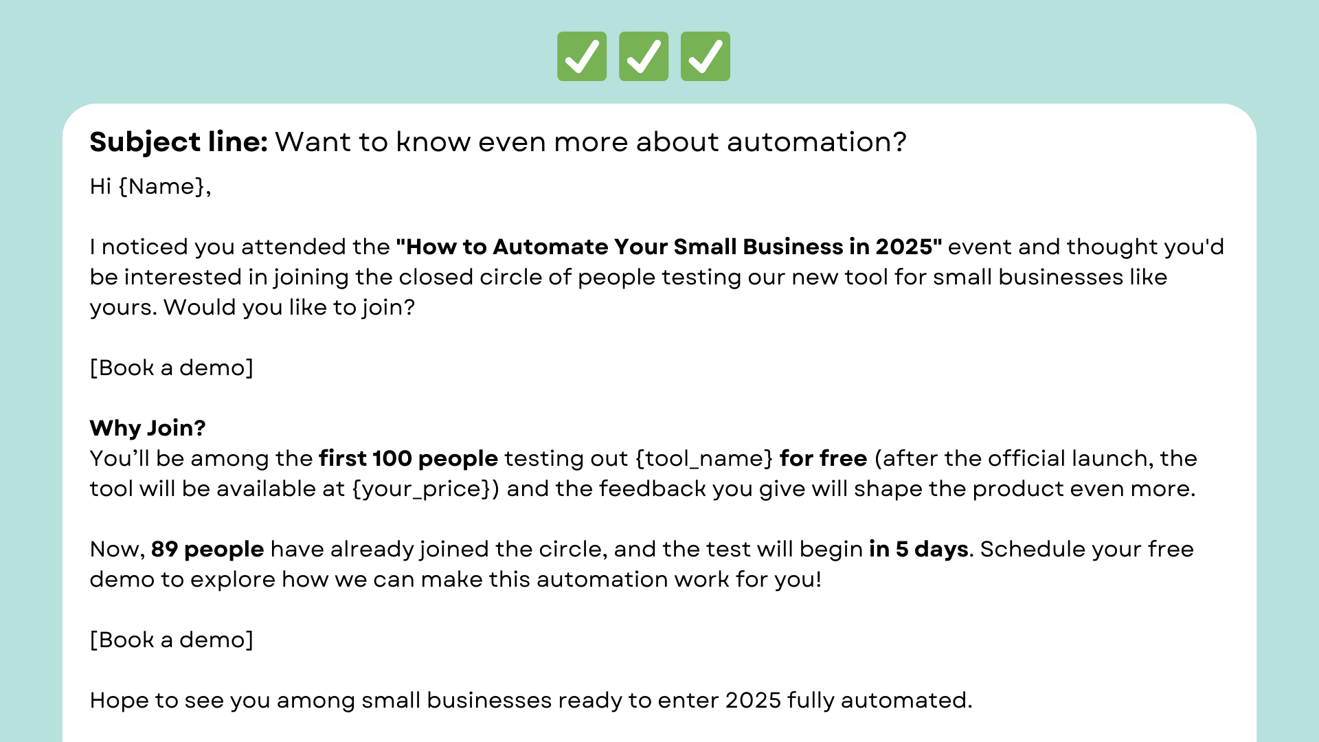
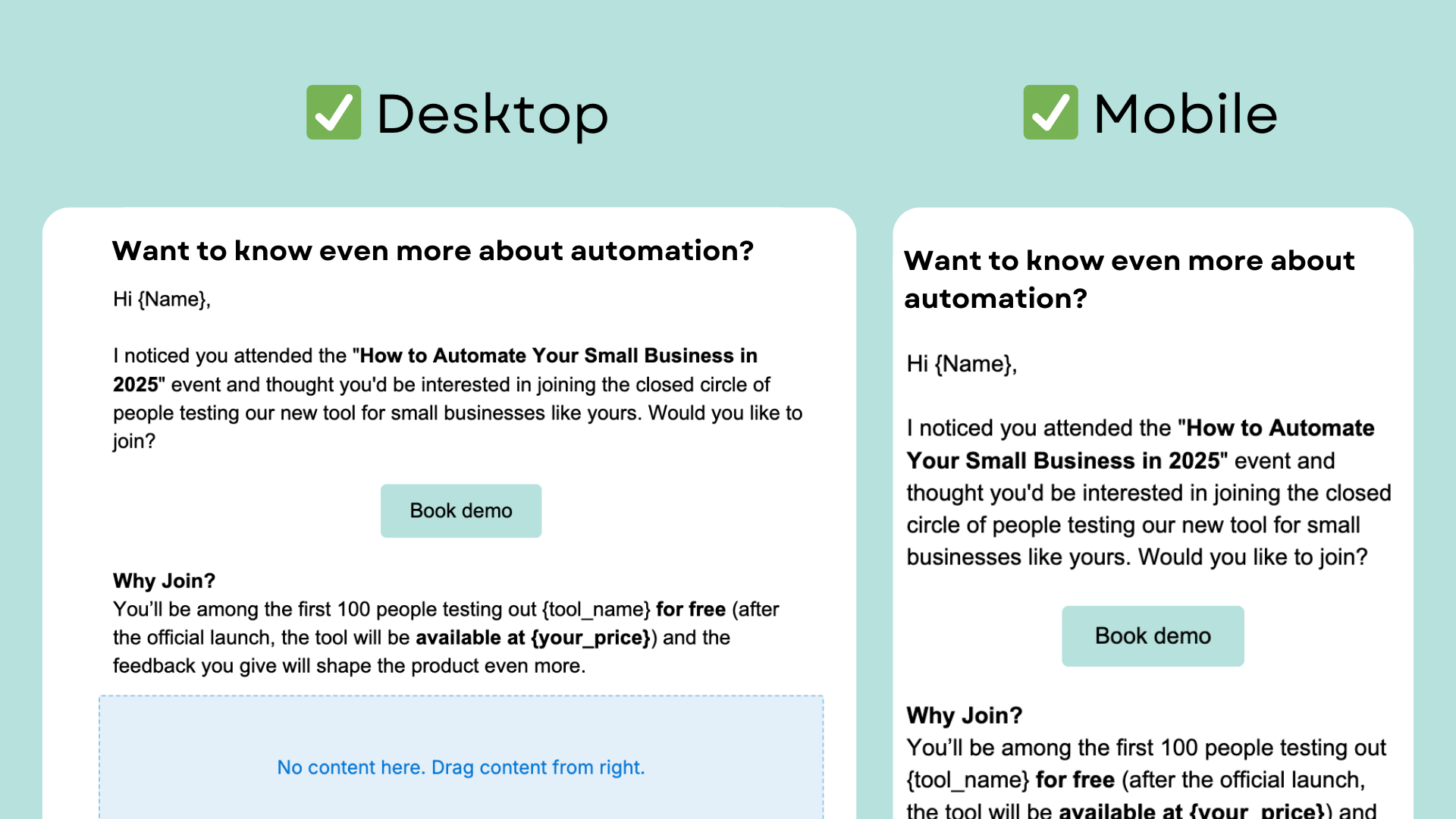
For example, let’s say you’re searching for new leads on LinkedIn. You spot an event titled “How to automate your small business in 2026.” Your company offers a business automation tool, so it’s a match. You essentially just found a list of potential leads who fit the segment: small business owners (SBOs) interested in business automation!
Now, you can get emails of those attendees (there are plenty of tools like LinkedIn Sales Navigator allowing you to get emails of event attendees) and craft a “SBO automation webinar” template like this one:
If you’re looking to dive deeper into segmentation, try a B2B email marketing service. These tools make it easier to create spot-on content for each audience segment.
Look for tools with advanced targeting and behavior analytics, which can help you understand your segment better and increase the likelihood of converting leads into loyal customers.
Now, there are hundreds of webinars happening every week on LinkedIn alone. This template may be used for most of them—just change the event's name, and you are ready to reach another group of SBOs.
Email builders for high-converting templates: Spend hours, not days
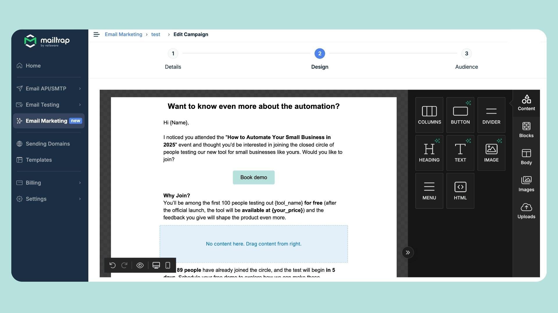
Why make things harder than they need to be? There are dozens of email builders that can make emails a fun and fast thing, without sparring with HTML code.
In fact, if you need to craft an email (a campaign or template, as in our case) and you don’t have time or ability to reach the designer and email developer, use drag-and-drop tools.
Email builders work like multitools, storing everything you need to get the job done in one place.
They offer intuitive interfaces that let you focus on creativity rather than coding. With a few clicks, you can customize templates, add your logic, and adjust layouts to match your brand—no tech degree required.
Another great advantage is consistency. Using pre-designed templates ensures that your emails have a uniform look and feel, which is crucial for brand recognition.
And don’t forget about testing; many email builders offer built-in testing features to preview your emails across different devices and email clients. And before you hit send, use spam testing tools like GlockApps to see how spam filters score your email and check where it lands across major providers.
Typically, designing an email with a designer and then passing it off to a developer can take several days, sometimes even a week, depending on complexity and revisions.
In contrast, an email builder helps you get it ready in just a couple of hours, all by yourself. And all this without sacrificing quality.
A/B test your emails, CTAs, and subject lines
Don't just set it and forget it. Experiment with different versions of your CTA to see what clicks.
Start with simple A/B tests where you try out different colors, text, and placements within the email.
For example, if you initially used a red "Book Now" button, test a green "Schedule Your Call" button to see which garners more interactions.
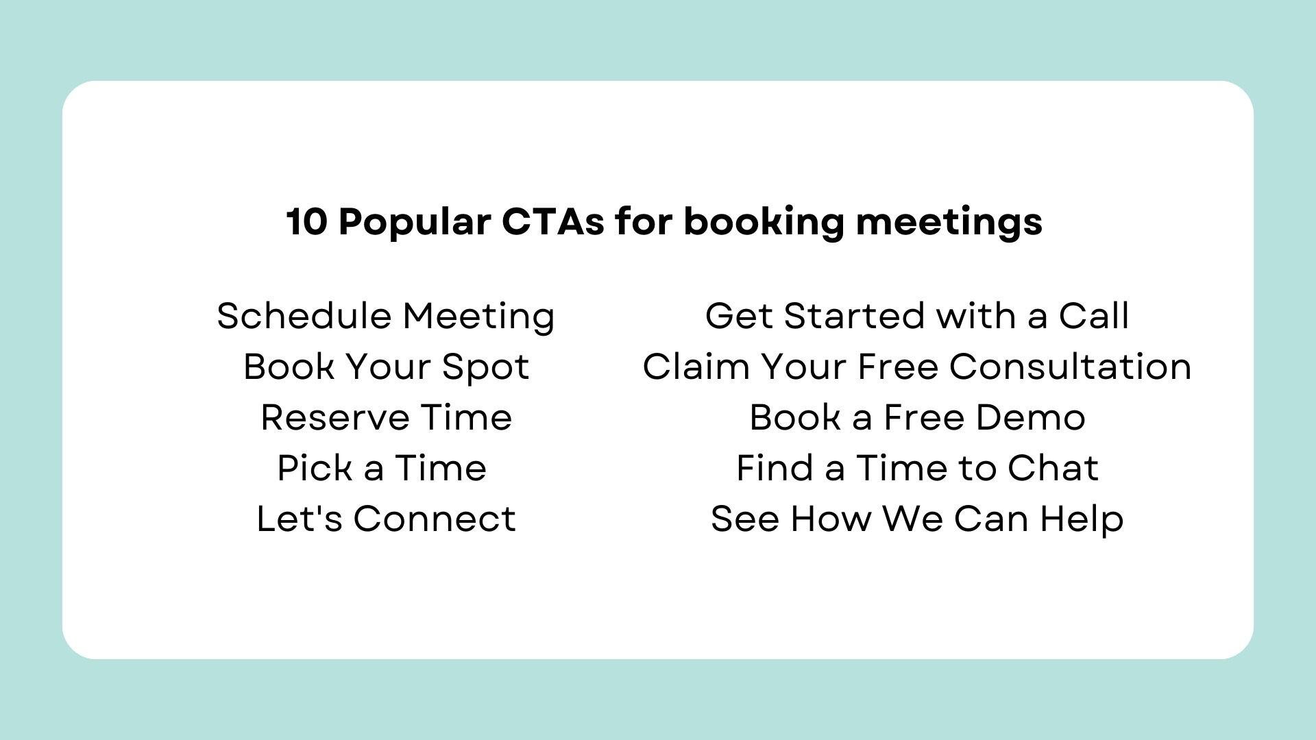
Consider testing your CTAs not just in isolation but also in combination with different subject lines. Sometimes, the impact of a particular CTA might increase when paired with an engaging subject line that sets the right tone from the start.
Additionally, don't shy away from testing the timing and frequency of your emails. Even the best CTA won't convert if it lands in your recipient's inbox at the wrong time.
Experiment with sending your emails at different times of the day or week to see when your audience is most responsive—maybe the beginning of the workday or lunch break is the moment your lead checks their inbox
Also, try segment-based testing. Basically, this means testing different CTAs for different groups of people in your audience. What really grabs the attention of one group might not work for another.
For example, if you're emailing a group of tech-savvy users, a CTA like "Reserve advanced demo" might be more engaging. But something simpler like "Book your first meeting" could work better for beginners.
|
Pro tip: Extend your testing to include different preheader texts. They are often overlooked, but can have a huge impact on your open rates. |
Performance and adjustments for better results
Keep a close watch on your key metrics, like open rates, click-through rates, and conversion rates. They’re like signposts telling you what’s working and what’s not.
For instance, if your click-through rate is low, your CTA may need a little spice. A tiny change, like tweaking the wording or color, could lead to a significant boost in clicks.
Remember, the goal of testing is to continually refine and optimize your emails. By seeing what works best, you can craft CTAs that not only stand out visually but also compel your readers to take action.
Ready to book more meetings?
Creating email templates that resonate isn't rocket science, but it does require some finesse. It's about blending eye-catching design, clear messaging, and a bit of personality.
When you strike this balance, you're not just sending out emails; you're making invitations that really connect with your audience.
Remember to play around with your CTAs, personalize your approach, and keep an eye on those metrics to continually fine-tune your strategy.
With these elements in place, your emails won't just fill inboxes—they'll fill your calendar with the meetings you’re aiming for.
Subscribe to our newsletter
Get productivity tips, news, articles and resources.
Written by
Daria Roshchyna
Daria, Technical Content Writer at Mailtrap, is an enthusiastic content writer who loves breaking down complex concepts into simple, easy-to-understand language. With a passion for sending transactional and marketing emails, Daria has spent the past two years honing her skills in email deliverability, A/B testing, and email automation. Her job and passion is to write clear guides and educational blog posts, helping everyone set up their email infrastructure and start sending emails with ease.

.png?width=1041&height=1394&name=eBook%20CTA%20-%2045%20Email%20Templates%20That%20Drive%20Results%20(1).png)


